サイトは動いているのに凡庸に見える。必要なのは視覚システムです
機能しているのにテンプレートっぽく見えるWebサイトは、多くの場合、機能不足ではなく視覚システム不足です。好きなサイトから判断を借り、自分のブランドに変える方法を解説します。
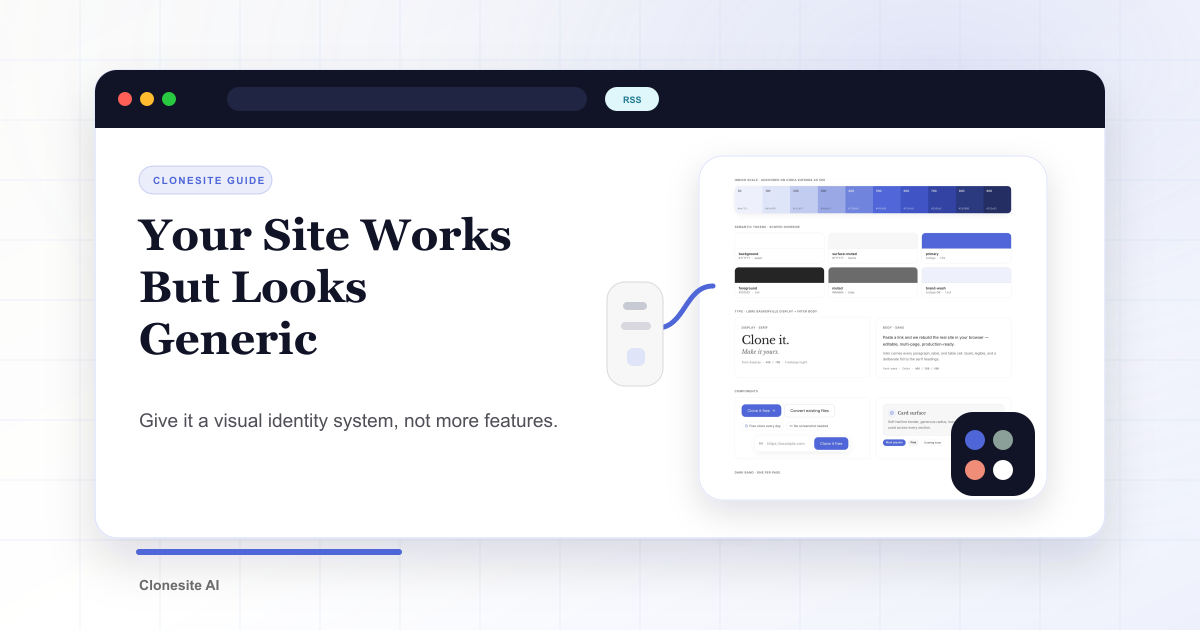
ランディングページは正確で速くても、記憶に残らないことがあります。サイトが動いているのに凡庸に見えるとき、足りないのは機能ではなく視覚システムであることが多いです。
視覚システムとは、ページを1つのブランドに見せるための判断です。accent color、font、contrast、white space。これらが決まると、シンプルなページでも意図を持って見えます。
凡庸に見える3つのサイン
- アクセントカラーが多すぎる。 すべてのsectionが別の色で主張し、主役が消えます。
- default fontに頼りすぎる。 見出しも本文も同じsystem sansで、声がありません。
- 余白の代わりにグレー背景を使っている。 rhythmではなく背景色でsectionを分けています。
これは情報量の問題ではなく、判断の問題です。
テンプレートでは解決しない
templateを買い、logoを変え、色を塗り替えても、多くの場合は足りません。構造が匿名で、同じtemplateを使うサイトも多いからです。templateはlayoutをくれますが、声はくれません。
見た目ではなくシステムを借りる
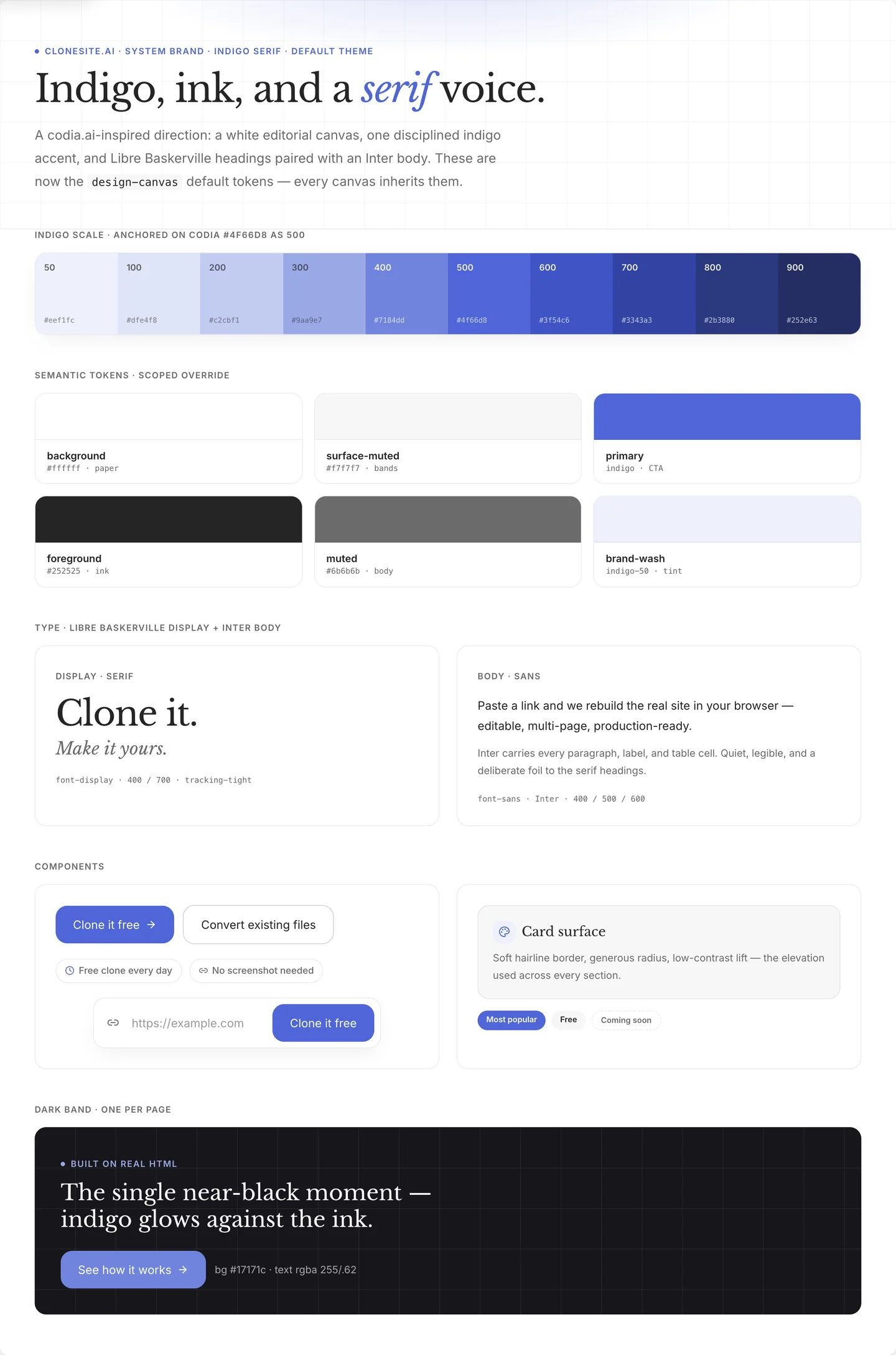
好きなサイトを見つけたら、pixelではなく判断を見ます。accentは何色か。どんなfont pairingか。contrastはどこに置かれているか。どれくらい余白を残しているか。
その判断は移植できます。自分の内容とbrandに載せれば、それは自分のページになります。具体的な手順は5つのデザイン判断で分解しています。
Clonesiteが役立つ場所
サイトを観察するのは簡単です。白紙から再構築するのは遅いです。
ClonesiteはURLを編集可能なsourceに変換します。実際の構造、spacing、font、breakpointを持った状態から始められるため、その上に自分の視覚判断を重ねられます。
私たちはこの方法で自社landing pageを作り直し、before/afterとして記録しました。同じ製品でも、印象は大きく変わります。
URLを貼る。sourceを得る。全体をrestyleする。自分のブランドにする。
FAQ
なぜ自分のサイトがテンプレートっぽく見えるのですか?+
視覚システムが不足しているからです。固定されたアクセントカラー、選ばれた書体の声、意図的な余白がないと、機能が揃っていても凡庸に見えます。
Webサイトをプロっぽく見せるには?+
アクセントカラーを1つに絞り、見出し用の書体を選び、section間に十分な余白を作ります。この3つだけでも、機能追加より見た目の質に効きます。
Webの視覚アイデンティティとは何ですか?+
色、書体、contrast、spacingなど、すべてのページを同じブランドに見せるための小さな反復可能な判断です。単発の見た目ではなく、システムです。
関連ガイド
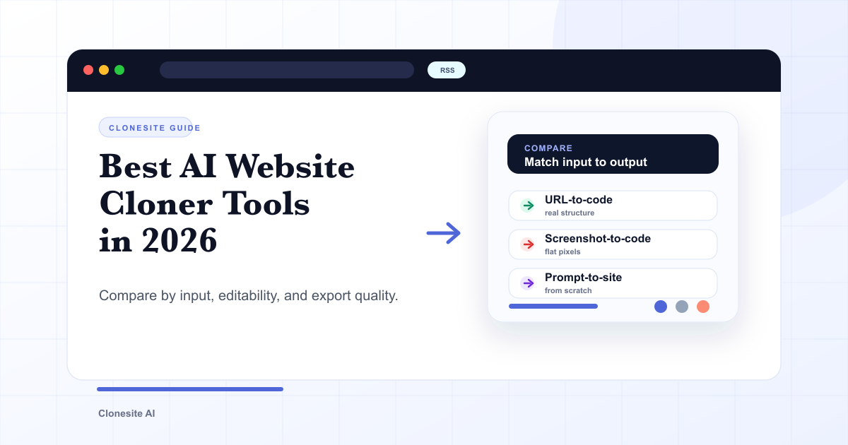 2026年版 AIウェブサイトクローンツールの選び方とおすすめ比較最適なAIウェブサイトクローンツールは、入力と出力があなたの目的に合うものです。実在するレイアウトを再利用するならURLからコードへ、静止画のモックアップならスクリーンショットからコードへ、ゼロから作るならプロンプトからサイトへ。選ぶ前に、入力タイプ・編集可否・エクスポート品質で比較しましょう。
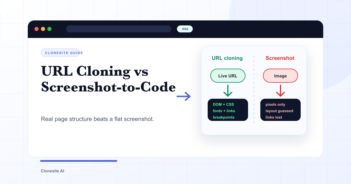 URLクローンとスクリーンショットからコードへ:出力で本当に変わることURLクローンは公開ページの本物の構造 — DOM、CSS、フォント、リンク、レスポンシブのbreakpoint — を読み取り、編集可能なコードとして再構築します。スクリーンショットからコードへはピクセルしか見えないため、レイアウトを推測し、フォントやリンク、レスポンシブを失います。その差は、出力の使いやすさに直接あらわれます。
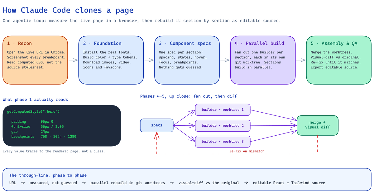 Claude CodeでWebサイトをクローンする方法(2026): 実際のパイプラインと失敗しやすい箇所Claude CodeでWebサイトをクローンするための実践ガイド。実ブラウザでページを計測し、React/Tailwindの編集可能なコードに再構築する5段階のagentic pipeline、必要なセットアップ、無人実行で崩れやすいサイト、ホスト型clonerを選ぶべき場面を説明します。