Your Site Works But Looks Generic. Here's How to Give It a Visual Identity
A working site that still looks like a template is usually missing a visual system — not more features. How to borrow one from a site you admire and make it yours.
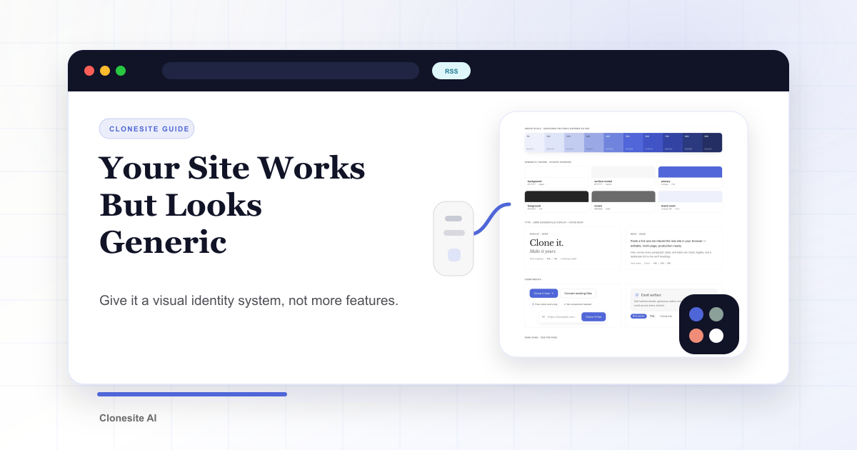
Your landing page can be accurate, fast, and still forgettable. When a site "works but looks generic," the missing piece is usually a visual system — not more features and not more copy.
A visual system is the small set of decisions that make a page feel like it belongs to one brand: which accent color, which fonts, how much contrast, how much white space. Get those right and even a simple page feels intentional. Skip them and even a feature-rich page feels like a template.
Three signs your site looks generic
You can usually diagnose it in seconds:
- Too many accent colors. Every section highlights something in a different color, so nothing reads as the main thing.
- Default fonts doing all the work. One system sans-serif for headings and body, at a couple of sizes. Nothing has a voice.
- Grey boxes instead of white space. Sections are separated by alternating grey blocks because there is no rhythm doing that job.
None of these are information problems. They are system problems. You don't fix them by writing more — you fix them by deciding.
A template won't fix this
The common shortcut is to buy a template, swap the logo, recolor it, and ship.
It rarely works, for two reasons. The structure is still someone else's, so the page has no point of view. And the same template is used by thousands of other sites, which makes it read as more generic, not less. A template can hand you a layout. It cannot hand you a voice.
Borrow a system, not a look
There is a better move: find a site whose design you admire, and borrow its decisions instead of its pixels.
Don't copy its hero — ask why the hero works. How many accent colors does it use? What fonts are paired, and how? Where does it put contrast? How much does it leave empty? Those decisions are portable. Drop your own content and brand into them and the result is yours, not a copy. We broke the specific decisions down into five concrete moves.
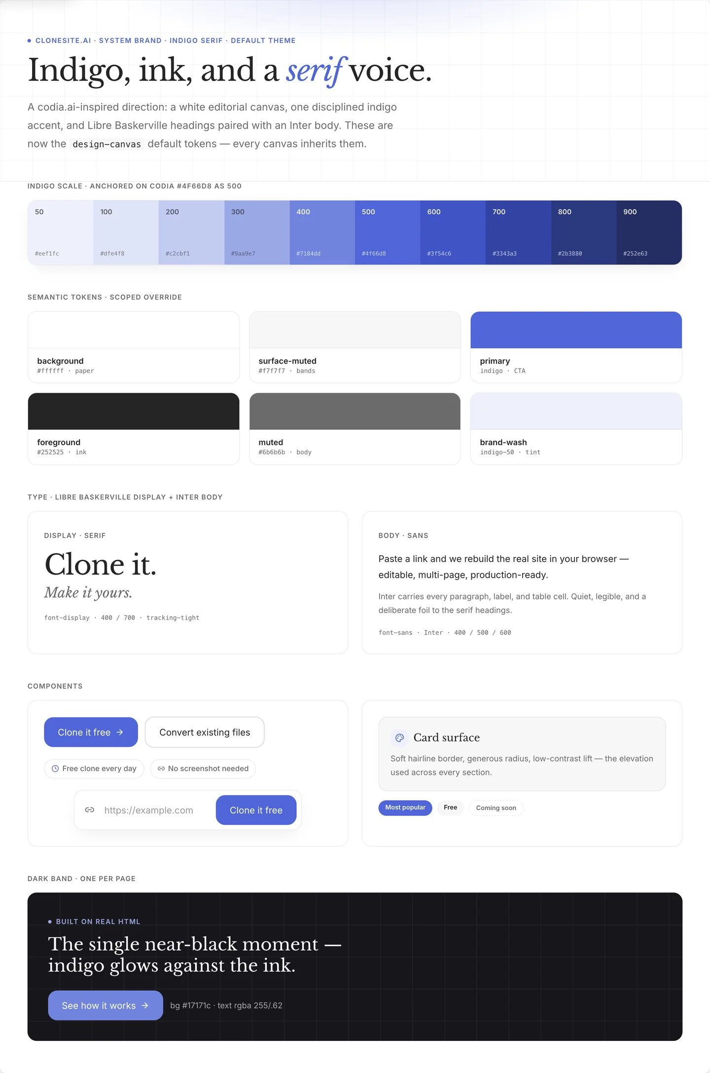
A visual system is a few decisions made once — one indigo scale, a serif-and-sans type pairing, spacing, components — then inherited by every page. This is ours.
Where Clonesite fits
Studying a site is easy. Rebuilding from a blank canvas is slow.
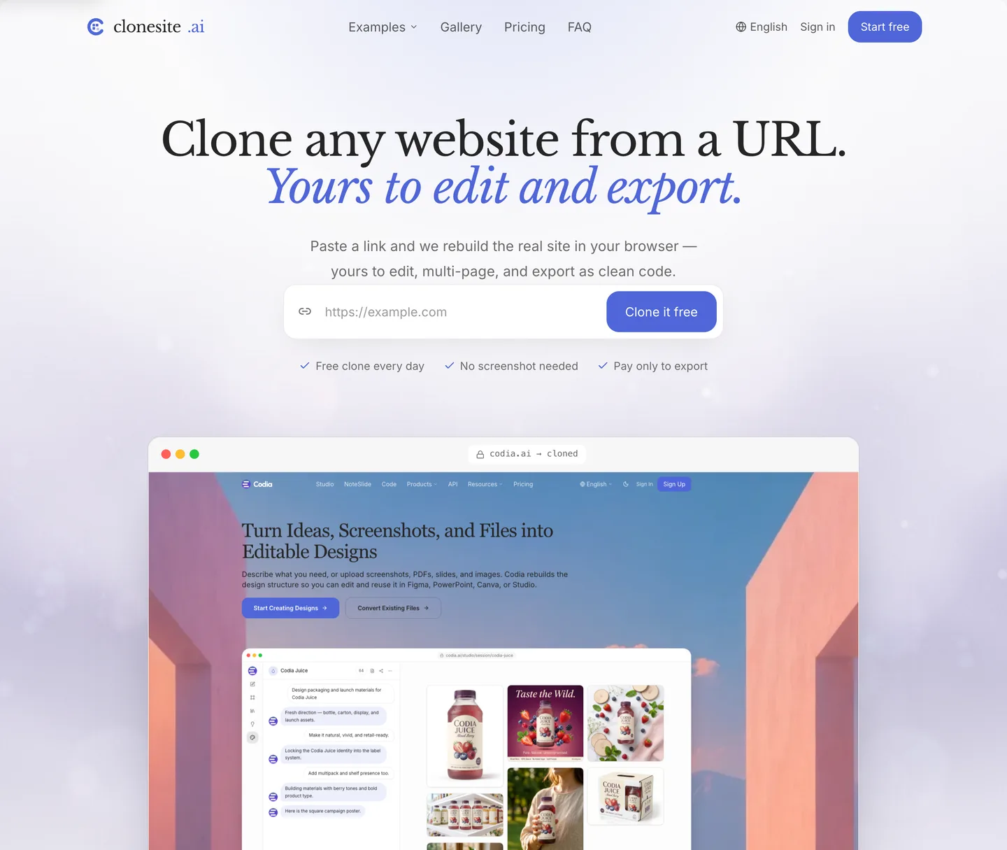
That is where cloning helps. Clonesite turns a URL into editable source — real structure, spacing, fonts, and breakpoints, not a screenshot. You start from a page that already works and make your visual decisions on top of it. It is a fast starting point for the redesign, not the redesign itself.
What this looks like in practice
We rebuilt our own landing page on exactly this method: studied a direction we admired (the template gallery is full of candidates), rebuilt the structure, then made our own decisions about color, type, and space. Same product, completely different feeling. We wrote down the whole before and after, section by section.
Paste a URL. Get the source. Restyle the whole site. Make it yours.
We rebuilt our own landing page on exactly this system — same product, a completely different feeling.
FAQ
Why does my website look like a template?+
Because it is missing a visual system, not because it lacks features. Without a fixed accent color, a chosen type voice, and deliberate white space, even a feature-rich page reads as generic.
How do I make my website look professional?+
Pick one accent color and give it one job, choose a display font for headlines, and add white space between sections. These three decisions do more for perceived quality than adding more features.
What is a visual identity on the web?+
The small set of repeatable decisions — accent color, fonts, contrast, and spacing — that make every page feel like it belongs to one brand. A visual identity is a system, not a single look.
Related guides
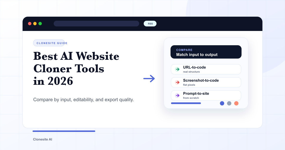 Best AI Website Cloner Tools in 2026The best AI website cloner is the one whose input and output match your job — URL-to-code for reusing a real layout, screenshot-to-code for a static mockup, and prompt-to-site for building from scratch. Compare them by input type, editability, and export quality before you pick.
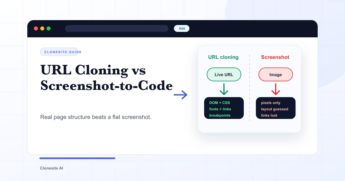 URL Cloning vs Screenshot-to-Code: What Actually Changes in the OutputURL cloning reads a live page's real structure — DOM, CSS, fonts, links, and responsive breakpoints — and rebuilds it as editable code. Screenshot-to-code only sees pixels, so it infers layout and loses fonts, links, and responsiveness. The difference shows up directly in how usable the output is.
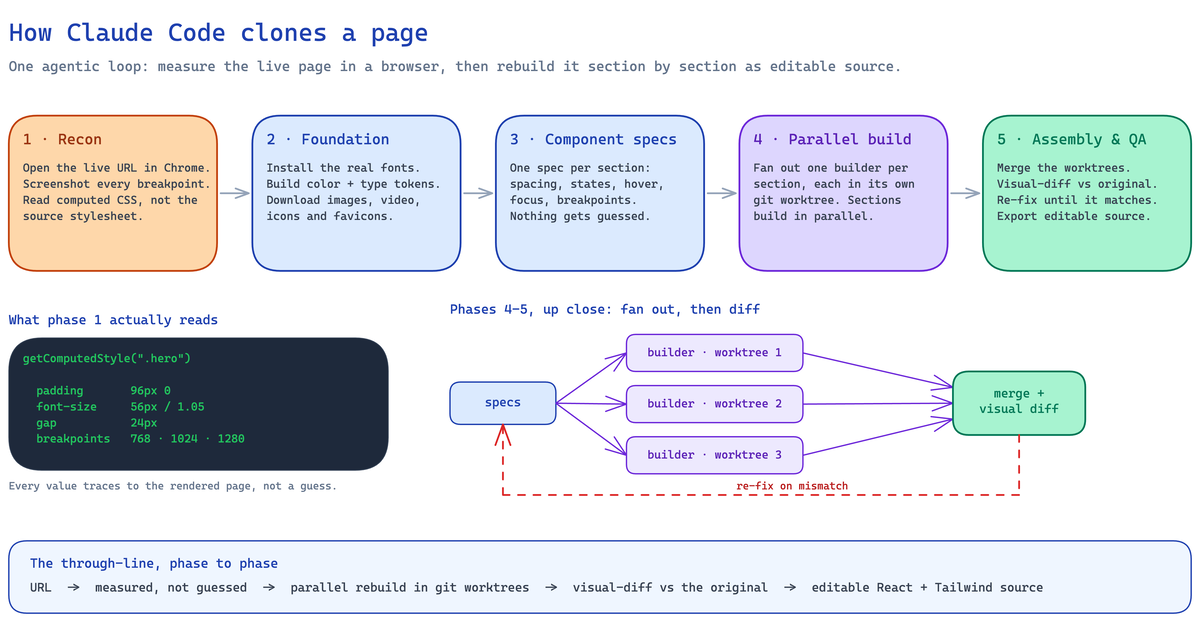 How to Clone a Website With Claude Code (2026): The Real Pipeline, and Where It BreaksA builder's guide to cloning a website with Claude Code — the five-phase agentic pipeline that measures a live page and rebuilds it as editable React and Tailwind source, the setup it needs, the sites where an unattended run breaks, and when to run it hosted instead.