5 Design Moves That Turn a Cloned Page Into a Brand
Five concrete design decisions — one accent color, a serif voice, white space, real proof, and design tokens — that turn a cloned page into a brand without looking copied.
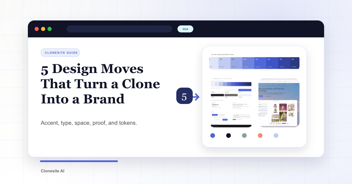
A clone gives you structure. These five moves give it a brand — and keep it from looking copied.
Most of the visual gap between "template" and "brand" comes down to a handful of decisions. Here are the five we make every time, with the before and after from our own redesign as the example.
1. One accent color, not a palette
Pick a single accent and give it one job: the headline accent, links, the primary button, focus states. Everything else stays neutral.
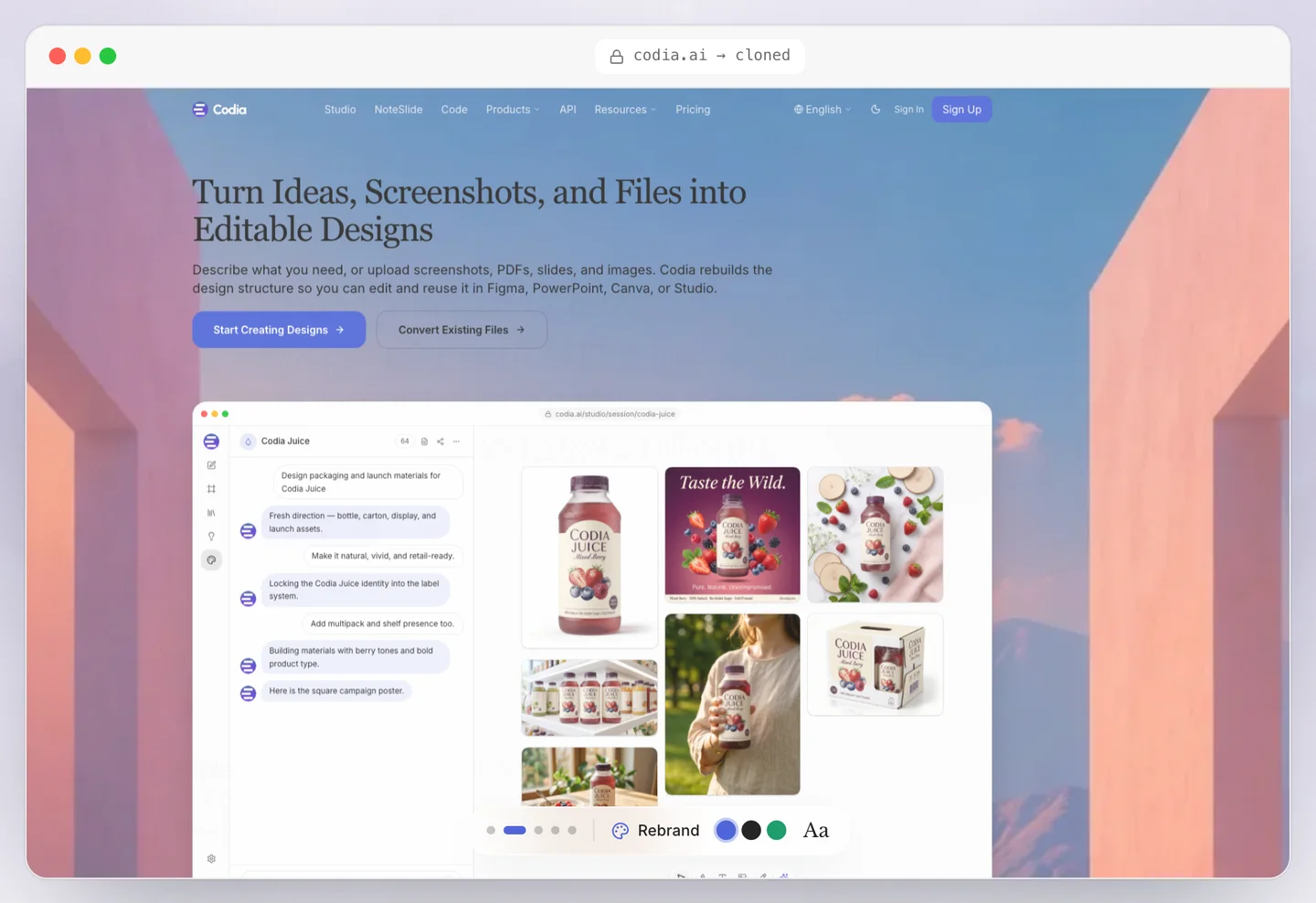
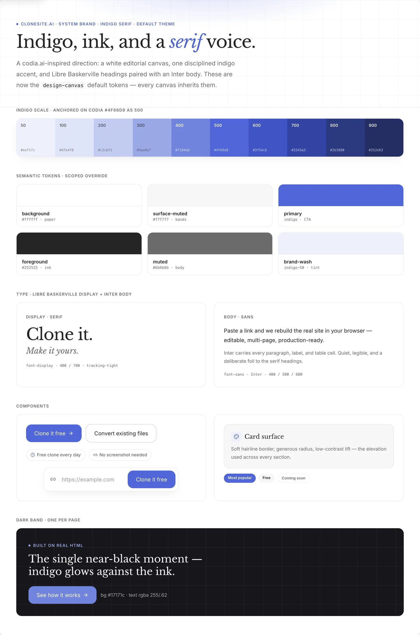
Our old page used a green that doubled as both accent and background mood. The new one uses a single
indigo, #4f66d8, and nothing else competes with it. A restrained accent reads as intentional; a
page that tints everything reads as a downloaded theme.
Your move: list every color on your page, then cut it to one accent plus a neutral grey scale.
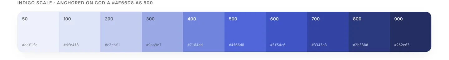
One accent, built into a full scale anchored on #4f66d8 — and nothing else competing for attention.
2. A serif voice for a tool
Pair a serif heading with a sans body and your product suddenly sounds like an editor instead of a dashboard.
We put Libre Baskerville headings over an Inter body. It even let us rewrite the hero into two beats:
Clone any website from a URL. Yours to edit and export.
Your move: give headings a face with some character; keep the body a clean, readable sans.
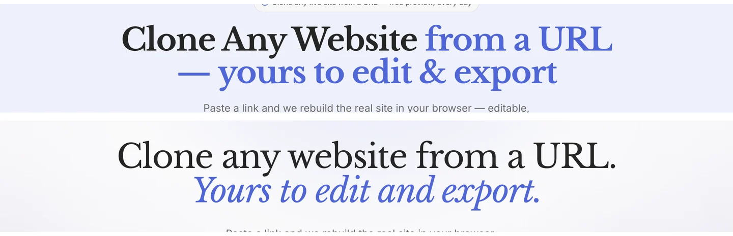
The headline before (top) and after (bottom) — a bold sans line becomes a serif rewrite split into two beats.
3. White space instead of grey boxes
One light canvas plus a single dark band beats endless alternating greys.
Our old page separated every section with a grey block. The new one is white almost all the way down, with exactly one near-black band saved for the most technical claim. Contrast only works when it is rare.
Your move: delete the alternating backgrounds, let spacing separate sections, and spend your one big contrast moment carefully.
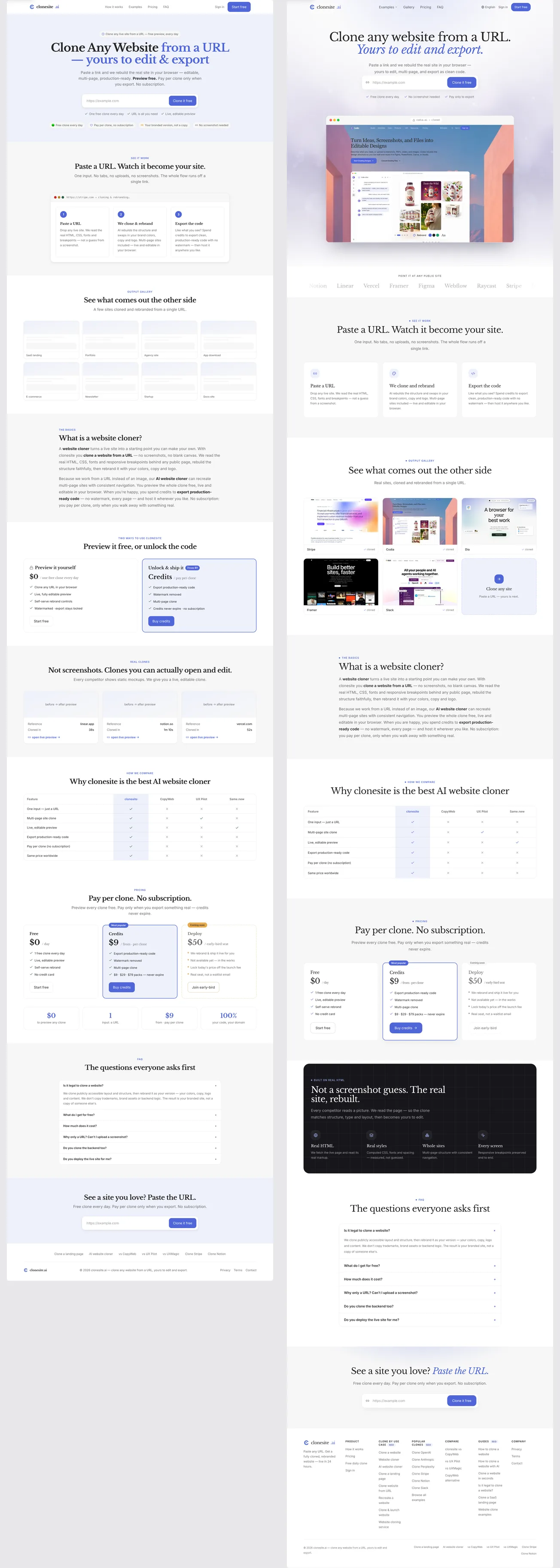
The whole page, before (left) and after (right) — grey blocks give way to white space and one dark band.
4. Show proof, don't claim it
Replace trust badges with a preview of the actual result.
Our old hero asserted editability in a badge ("Your branded version, not a copy"). The new one shows a browser frame cycling through real clones, plus a quiet logo strip. "Editable source" is abstract; a picture of the result is not.
Your move: find the one claim users most need to believe, and show it instead of stating it.
Proof shown, not claimed — a browser frame with a real clone, where the old page had a text badge.
5. Turn it into tokens, not a one-off page
Define color, type, and spacing once, as tokens, so the identity holds on every page — not just the one you styled.
We moved the new look into shared tokens and components. That is why pricing, the gallery, the FAQ, and the footer all feel like the same brand without re-styling each one.
Your move: store your accent, fonts, and spacing as variables, and build every page from them.
The decisions frozen into tokens — color, type, spacing, components — so every page inherits the same brand.
Why this doesn't look copied
Notice that none of these moves copy the source site. You borrowed decisions — how many colors, which type pairing, where the contrast goes — not assets.
The last step seals it: replace every logo, line of copy, image, and claim with your own. Borrowed decisions plus your own content is a brand. Borrowed assets is a copy — and a legal problem.
If you need a starting structure, the template gallery has editable clones of Stripe, Notion, Slack, and more to run these five moves on.
Paste a URL. Get the source. Restyle the whole site. Make it yours.
FAQ
How do I customize a cloned website?+
Pick one accent color, add a contrasting display font, increase white space, replace borrowed proof with your own, and convert the decisions into design tokens. These five moves turn a cloned scaffold into a brand without looking copied.
How do I make a cloned site look original?+
Stop matching the source. Choose a single accent color with one job, use a typeface the original did not use, and cut sections so the page tells your story instead of theirs.
What are design tokens?+
Design tokens are named values — colors, fonts, spacing, radii — stored once and reused across the page. They turn a one-off redesign into a system, so the next page you build stays on brand.
Do I need to know how to code to customize a clone?+
No. You can swap colors, fonts, and copy in a visual preview before exporting. Coding is only needed if you want to change the underlying component structure.
Related guides
 Best AI Website Cloner Tools in 2026The best AI website cloner is the one whose input and output match your job — URL-to-code for reusing a real layout, screenshot-to-code for a static mockup, and prompt-to-site for building from scratch. Compare them by input type, editability, and export quality before you pick.
 URL Cloning vs Screenshot-to-Code: What Actually Changes in the OutputURL cloning reads a live page's real structure — DOM, CSS, fonts, links, and responsive breakpoints — and rebuilds it as editable code. Screenshot-to-code only sees pixels, so it infers layout and loses fonts, links, and responsiveness. The difference shows up directly in how usable the output is.
 How to Clone a Website With Claude Code (2026): The Real Pipeline, and Where It BreaksA builder's guide to cloning a website with Claude Code — the five-phase agentic pipeline that measures a live page and rebuilds it as editable React and Tailwind source, the setup it needs, the sites where an unattended run breaks, and when to run it hosted instead.