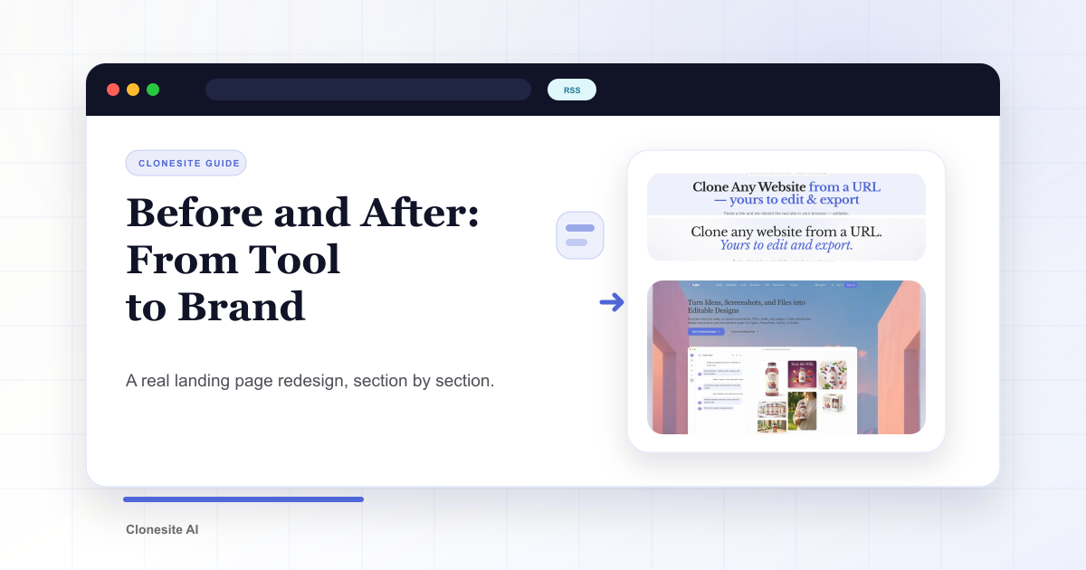
Before and After: Redesigning Our Own Landing Page From Tool to Brand
A section-by-section before and after of our own landing page redesign — one accent color, a serif voice, white space, real proof, and a workflow you can copy.
A page that works and a page people remember are not the same thing.
Our old landing page worked. It explained the product, listed the steps, and converted. But it looked like a tool — and tools are easy to forget. So we rebuilt the whole visual language of the page, top to bottom.
This is the before and after, section by section: what we changed, why, and the workflow you can copy on your own site.
One honest note first. Cloning gives you a high-quality starting point — editable source instead of a blank canvas. The redesign itself is still design work. The decisions below are what turn a working page into a brand.
The starting point: clear, but tool-like
The first version leaned on a "Paper and Evergreen" look: a green-washed hero, a bold sans-serif headline, and section after section separated by alternating grey blocks. Every fact was on the page. The hero alone carried a label pill, a row of emoji, and four trust badges.
The problem was not information. It was identity. Stacked grey panels and emoji badges read as "functional SaaS template," not "a brand with a point of view."
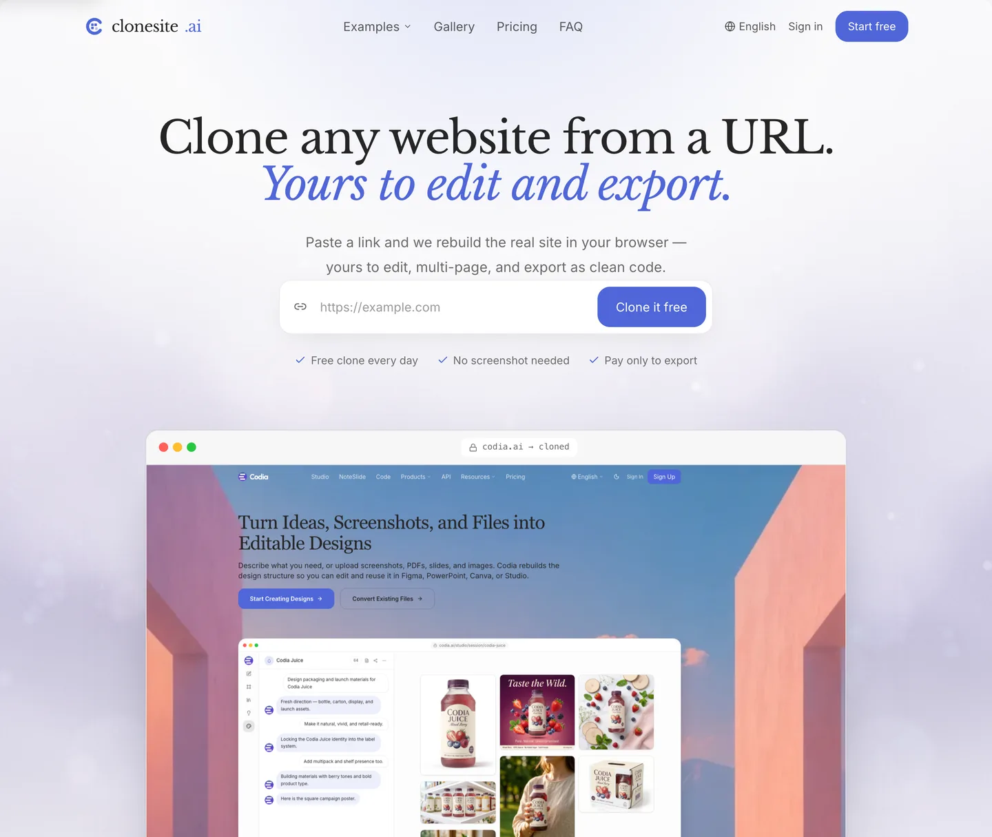
Before — the Paper and Evergreen hero. Everything is on the page; none of it has a voice.
One accent color, not a palette
Before: a green brand color doing double duty as accent and mood.
After: a single disciplined indigo — #4f66d8 — used only where it earns attention: the
headline accent, links, the primary button, and focus states.
A restrained accent reads as intentional. A page that tints everything reads as a theme you downloaded. Pick one accent, give it a job, and let the rest of the page stay neutral.
A serif voice, even for a tool
Before: one bold sans-serif for everything.
After: Libre Baskerville serif headings over an Inter body.
A serif headline does something a tool rarely allows itself: it sounds like an editor, not a dashboard. The clearest example is the hero headline.
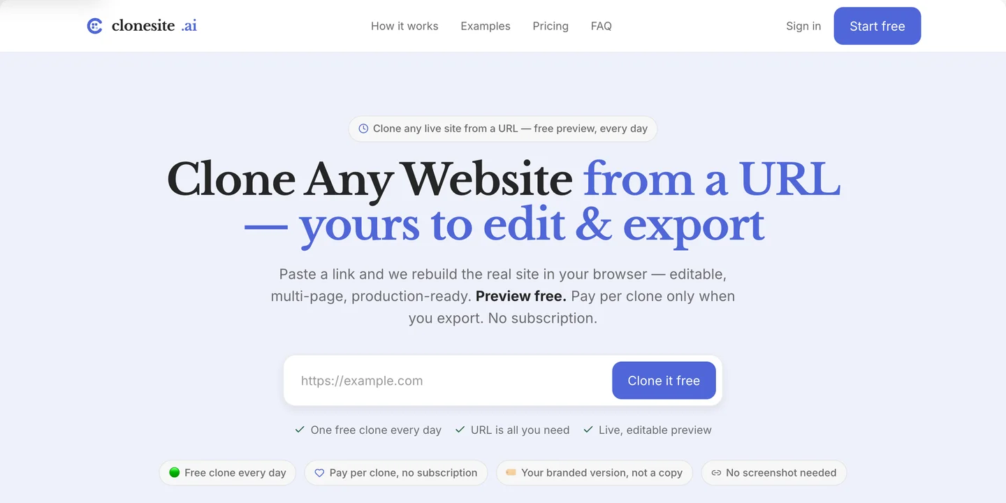
Before — one line, packed:
Clone Any Website from a URL — yours to edit & export
After — two emotional beats:
Clone any website from a URL. Yours to edit and export.
The first line says what happens. The second, set in italic serif, says why it matters: ownership. Almost the same words. A completely different feeling.
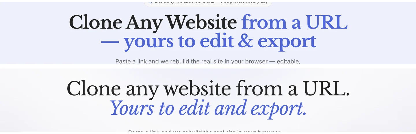
Top: the old sans-serif headline. Bottom: the serif rewrite, split into "what happens" and "why it matters."
White space, not grey boxes
Before: alternating grey and white bands the whole way down to separate sections.
After: one white editorial canvas — and exactly one near-black band, reserved for the most technical claim on the page: "Not a screenshot guess. The real site, rebuilt."
Contrast works when it is rare. When every other section is grey, none of them stand out. When the page is white and one band goes dark, that band becomes the thing you remember. We let a soft indigo glow and a faint graph-paper grid carry depth, instead of stacking drop shadows.
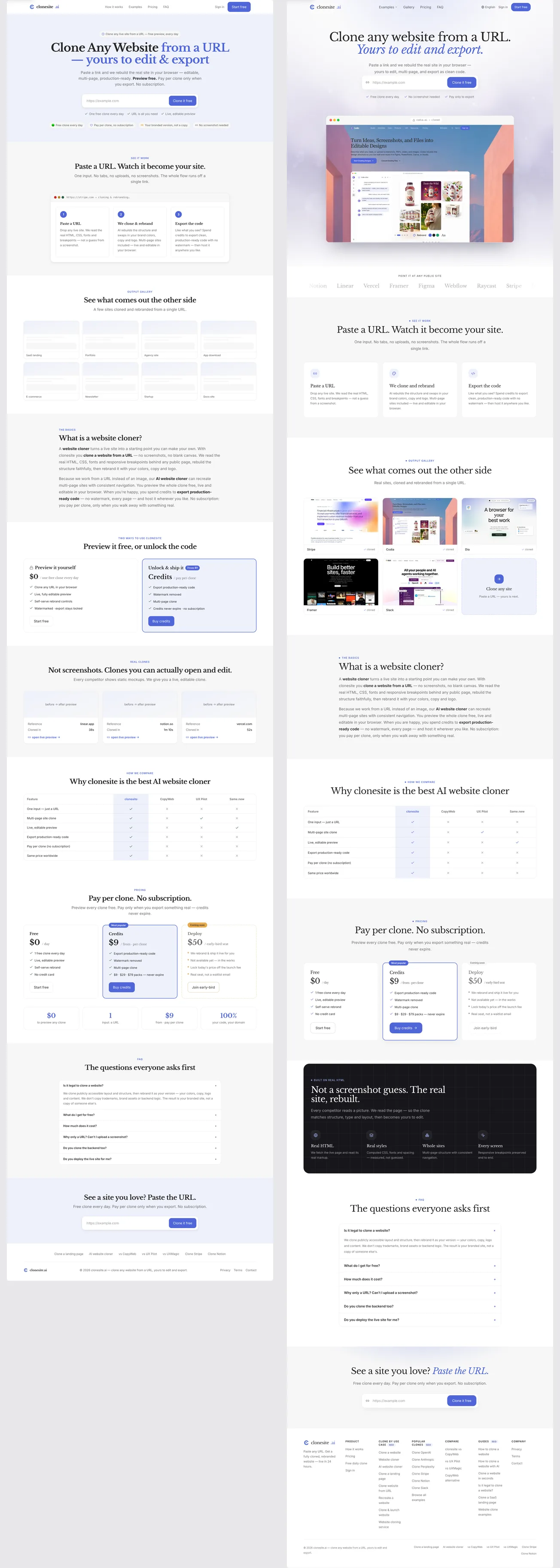
The whole page, before (left) and after (right): stacked grey blocks versus one white canvas and a single dark band.
Show the proof, don't claim it
Before: the hero claimed editability with text — badges like "Your branded version, not a copy."
After: the hero shows it. We added a browser frame under the input that cycles through real clones — Stripe, Framer, Slack and more — with an address bar reading "domain → cloned" and a small rebrand control hinting at swapping colors and type.
"Editable source" is abstract. A browser preview makes it concrete. We also added a quiet logo marquee — "Point it at any public site" — so credibility is established before the first scroll, not asserted in a badge.
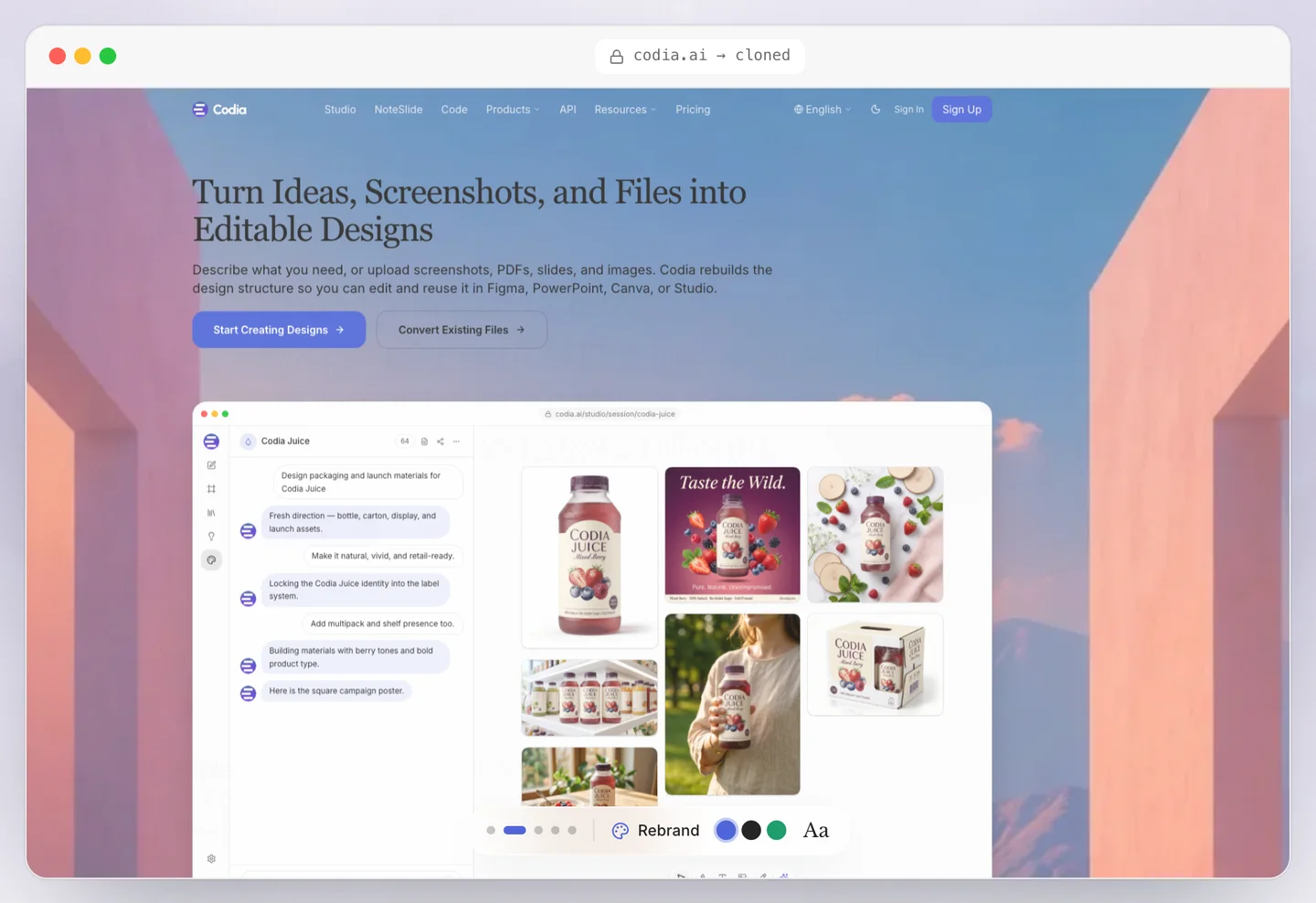
The redesigned hero shows a live clone in a browser frame — proof instead of a promise.
Cut sections to sharpen the story
A redesign is also a chance to remove. The old page had a "two ways to use it" section and a "real cases" section. Useful, but they diluted the path. We cut both.
The new order is tighter: hero, logos, how it works, gallery, what it is, compare, pricing, the dark technical band, FAQ, CTA. Fewer turns, less scroll fatigue, one clear narrative.
Make it a system, not a page
The most important change is invisible on any single screen. Instead of styling the landing page directly, we turned the new look into design tokens — a color scale, type, spacing, and the dark-band and glow helpers — and built the page from shared components.
That is why the new identity holds across pricing, the gallery, the FAQ, and the footer. A page you style once drifts. A system you define once stays consistent everywhere.
After — the Indigo Serif hero, built from shared tokens so every page inherits the same identity.
The same system, section by section
The hero is where most redesigns stop. But a visual system only earns its keep if it reaches every section. Here is the rest of the page — before (left) and after (right).
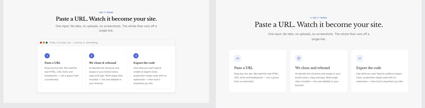
How it works — grey cards and number chips become a serif title over clean white cards.
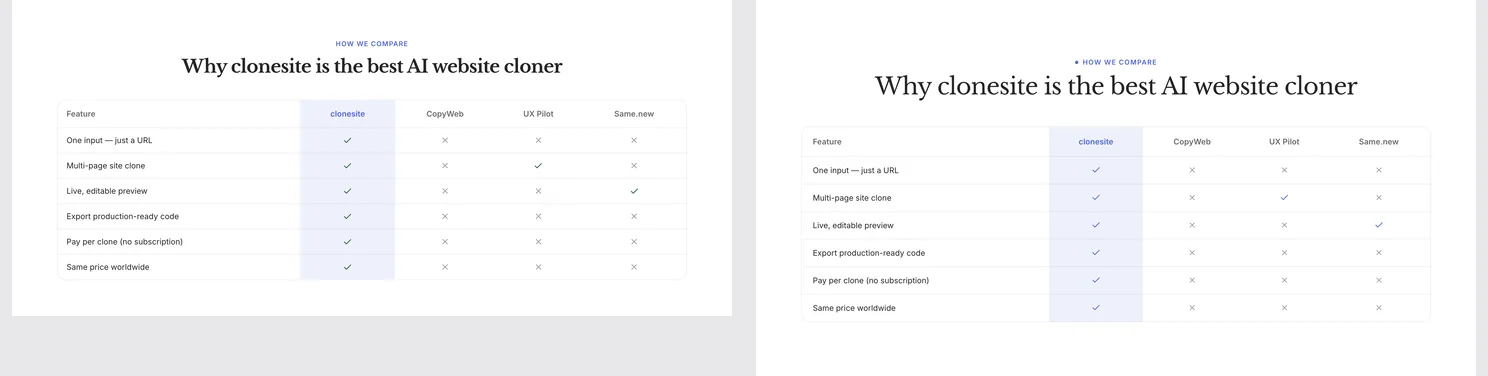
The comparison table — same information, the same one-accent palette as the rest of the page.
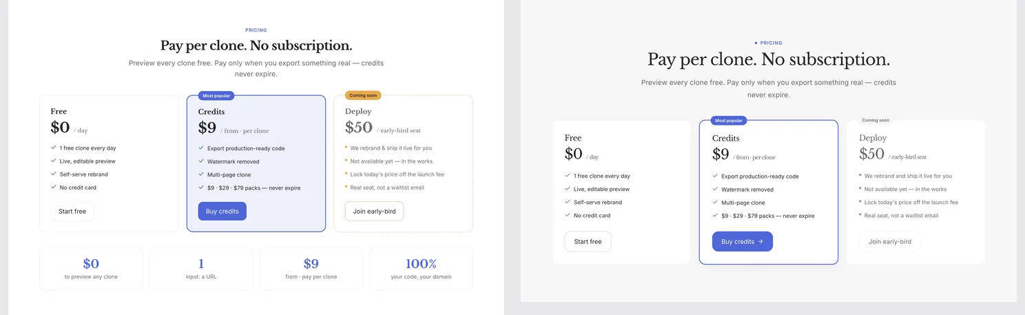
Pricing — the same three tiers, one indigo highlight instead of competing colors, and the noisy stats row dropped.
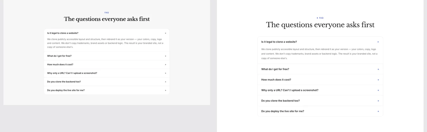
The FAQ — same questions, more breathing room.
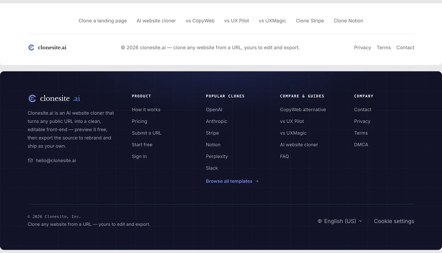
The footer got the biggest promotion — from one thin link row to a deep-indigo floor, with the old keyword-stuffed "SEO"-badge columns replaced by clean, unique links.
The workflow you can copy
You can run the same play on your own site — and this is where cloning fits.
- Find a site whose visual language you admire — the template gallery collects real clones of Stripe, Notion, Slack, and more. Not to copy — to study.
- Clone it with Clonesite: paste the URL, get an editable source version instead of a screenshot.
- Read its decisions: how many accent colors? what type pairing? where is the contrast? how much white space?
- Apply those decisions to your own content, with your own tokens.
- Replace every brand asset — logo, copy, images, claims — so the result is unmistakably yours.
- Export the code and ship it.
The clone gets you off the blank canvas. The decisions above are what make the page feel like a brand instead of a template.
Our page still says the same thing it always did. It just finally looks like it means it.
Paste a URL. Get the source. Restyle the whole site. Make it yours.
FAQ
How do I redesign my landing page?+
Work section by section. Pick one accent color, choose a display font, add white space, replace borrowed proof with real proof, and turn the decisions into tokens. Rebuilding one section at a time keeps the redesign shippable.
What makes a landing page memorable?+
A consistent visual system — one accent color, a clear type voice, deliberate white space, and real proof. Pages that look like tools are forgotten; pages with a system feel intentional.
Should I redesign or rebuild my landing page?+
Rebuilding from a clone is usually faster than redesigning in place. A clone gives you editable structure, so you spend energy on the brand layer instead of the layout.
Related guides
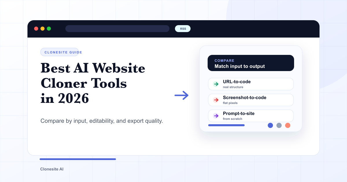 Best AI Website Cloner Tools in 2026The best AI website cloner is the one whose input and output match your job — URL-to-code for reusing a real layout, screenshot-to-code for a static mockup, and prompt-to-site for building from scratch. Compare them by input type, editability, and export quality before you pick.
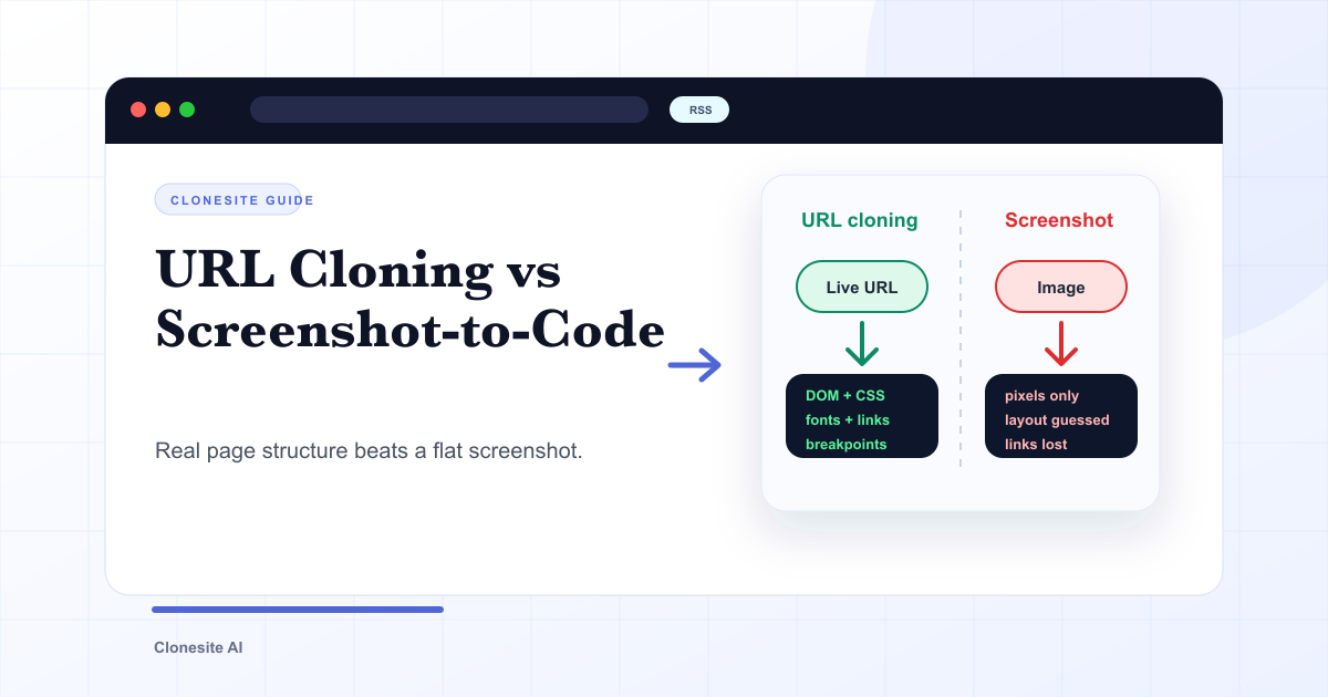 URL Cloning vs Screenshot-to-Code: What Actually Changes in the OutputURL cloning reads a live page's real structure — DOM, CSS, fonts, links, and responsive breakpoints — and rebuilds it as editable code. Screenshot-to-code only sees pixels, so it infers layout and loses fonts, links, and responsiveness. The difference shows up directly in how usable the output is.
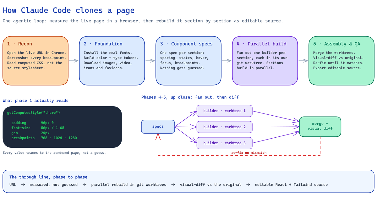 How to Clone a Website With Claude Code (2026): The Real Pipeline, and Where It BreaksA builder's guide to cloning a website with Claude Code — the five-phase agentic pipeline that measures a live page and rebuilds it as editable React and Tailwind source, the setup it needs, the sites where an unattended run breaks, and when to run it hosted instead.